Today, as a second post we will discuss as a block or chapter works to structure / Reading level:
1 - I looked for a picture of the character that has the force to support the presentation. (in some characters, paintings and Obelix incarnations has been necessary to hitóricos characters)
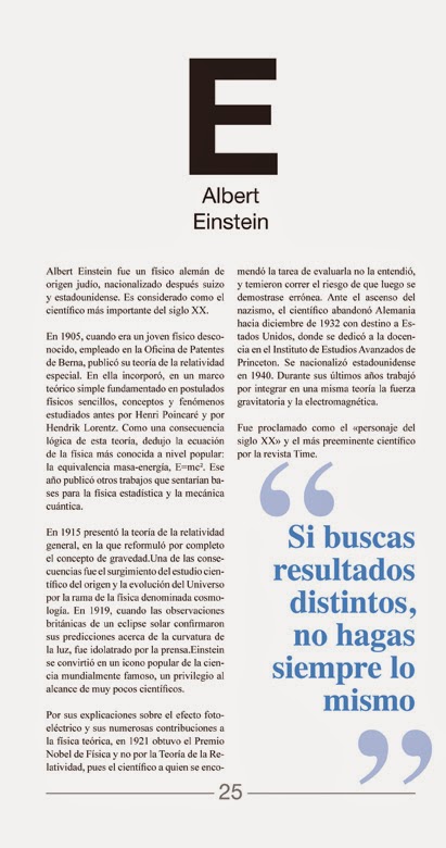
2 - introduction page is a lightweight biography of the character to contextualize their lifes.
On this page a phrase or quote character in accordance with that case is a declaration of principles oriented to the letter or reflection looming on pages 5 and 6. Another feature of the event is to present the chromia block also appears
3 - Next, after thinking a character makes an inquiry about the same, from the point of view of character, work / myth, physical appearance and profession. This research responds to a fairly exhaustive analysis, but gradually enters on the creative process.
4 - The 4th page is the iconography of characters, here is a study of volumes shapes and textures which I support the creation of the glyph.
5 - On the 5th this generation of typography, here proposes a color toned image as color psychology and trying to convey with the letter is linked.
6 - In this last page block I propose expand on some aspect that has arisen either by letter or through the character. Serves completion and closing block.