El cartel publicitario es un medio de comunicación que debe trasmitir un mensaje claro, contundente y eficaz, por medio de tipografía y gráficos o ambos. Debe captar la atención del espectador e impactar y de alguna manera hacer que recordemos el mensaje.
La composición de los elementos del cartel pueden ser diversos y dependen de la distancia y ubicación final. A más distancia se recomiendan menos elementos y y tipografías grandes y legibles, pero hablando de estilo y conceptualización el abanico de posibilidades crece.
Este es un proyecto de clase. Mi proyecto predefinido fue una agencia de viajes especializada en cruceros. En la investigación previa del proyecto detecte que casi todos los carteles del sector eran composiciones tipo mosaico o grandes imágenes del crucero en ruta.
Yo para experimentar con algunas posibilidades de photoshop decidí salirme de la línea marcada creando una composición fantástica en la que se hiciese hincapié en las múltiples actividades que engloba este tipo de vacaciones, con numerosas rutas, ciudades y planes con el nexo del barco y océano como denominador común. A nivel tipográfico me decante por una tipografía de acabado rounded que siempre son más "fluidas" que el resto de las tipografías. El uso de flashes y nexo digital para consultas específicas era de obligado uso en esta composición. Espero que os guste.
Mostrando entradas con la etiqueta elección de tipografia. Mostrar todas las entradas
domingo, 12 de abril de 2015
martes, 3 de marzo de 2015
Book: character type (Part II)
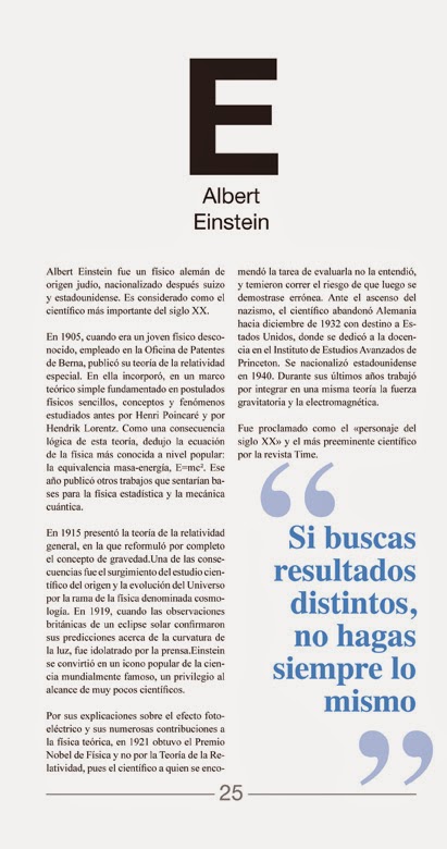
Today, as a second post we will discuss as a block or chapter works to structure / Reading level:
1 - I looked for a picture of the character that has the force to support the presentation. (in some characters, paintings and Obelix incarnations has been necessary to hitóricos characters)
2 - introduction page is a lightweight biography of the character to contextualize their lifes.
On this page a phrase or quote character in accordance with that case is a declaration of principles oriented to the letter or reflection looming on pages 5 and 6. Another feature of the event is to present the chromia block also appears
3 - Next, after thinking a character makes an inquiry about the same, from the point of view of character, work / myth, physical appearance and profession. This research responds to a fairly exhaustive analysis, but gradually enters on the creative process.
4 - The 4th page is the iconography of characters, here is a study of volumes shapes and textures which I support the creation of the glyph.
5 - On the 5th this generation of typography, here proposes a color toned image as color psychology and trying to convey with the letter is linked.
6 - In this last page block I propose expand on some aspect that has arisen either by letter or through the character. Serves completion and closing block.
Etiquetas:
anatomía del tipo,
books,
carácter tipo,
color tipográfico,
compaginación de textos e imágenes,
cubierta,
elección de tipografia,
producción editorial,
trabajo de clase
domingo, 1 de marzo de 2015
Book: character type (Part I)
The next issues of the blog correspond to a publishing project I had to do to Publishing production. Personally it is one of the best projects I've done during my academic course and I am very proud of him. I'll do it in three different post to avoid overloading the input.
I will explain more about the dynamics of the book in the following deliveries.
There are numerous texts on the formal aspects of typography, parts, elements, classification ... but there is no formal analysis of concepts of typography?. How certain nuances and typographical finishes that provide no obvious connotations to typography and design by extension? That is the purpose of this test, each subject, each and every design trend or brand subtext suggests the use of a typeface obviously these issues not being purely theoretical are not to follow to the letter, but through This research intend to investigate the associative process in choosing a typeface.
Etiquetas:
anatomía del tipo,
books,
carácter tipo,
color tipográfico,
compaginación de textos e imágenes,
cubierta,
elección de tipografia,
producción editorial,
trabajo de clase
Suscribirse a:
Entradas (Atom)